Comparison: High-Gloss vs Matte Offset Paper for Premium Jobs
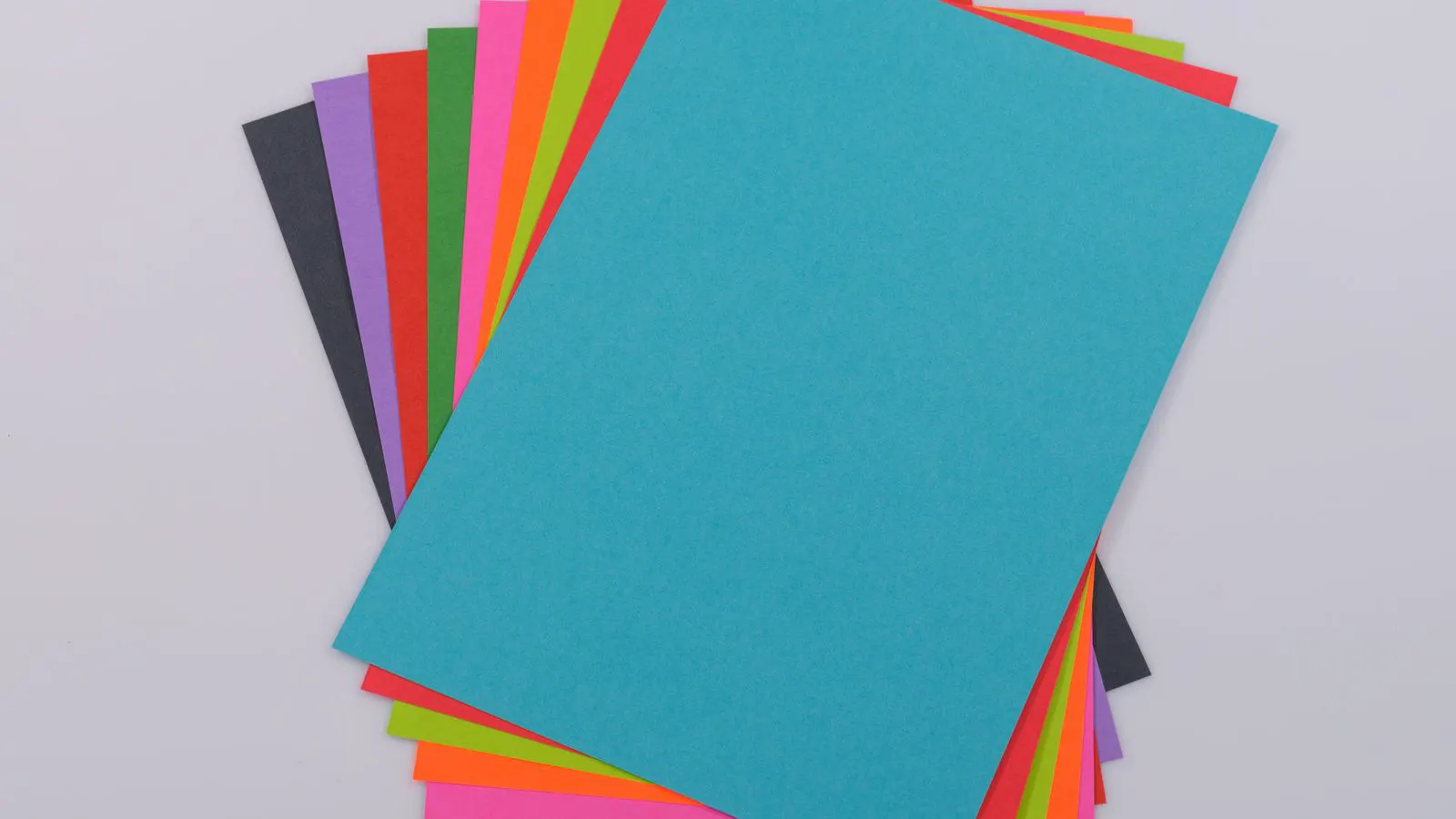
High-gloss offset paper delivers vibrant color and tactile pop, while matte stock reduces glare and offers a softer, premium feel. The choice depends on content type, viewing distance, and how the client perceives finish quality.
- High-gloss paper reflects light sharply, making inks appear brighter but exposing surface defects.
- Matte paper absorbs light, reducing glare and offering a consistent, muted finish for long-form text.
- Paper coating type directly affects ink drying, dot gain, and the final tactile impression of the job.
- Premium jobs often require test prints on both stocks before final approval.
Why Coating Changes the Feel of a Premium Job
Premium offset work depends heavily on the interplay between ink and substrate. The paper coating determines how much light reflects off the surface and how the ink behaves during the printing process. For clients who expect a polished result, the choice between high-gloss and matte offset paper is rarely just about aesthetics. It is a technical decision that affects color fidelity, readability, and the perceived value of the final product.
High-gloss paper has a smooth, hard surface. Light hits the coating and bounces back at a sharp angle. Matte paper has a softer, more diffuse surface. Light scatters across the paper, creating a lower-contrast appearance. Both options use offset printing, but the finish quality of the paper dictates how the inks interact with the substrate. The coating acts as a barrier layer. It controls capillary action, which governs how quickly ink is absorbed into the paper fibers versus how it remains on the surface. This dynamic influences the final dot gain, the sharpness of the image, and the resistance of the finished piece to physical handling.
Comparison Table: High-Gloss vs Matte Offset Paper
| Option | Best for | Limitations |
|---|---|---|
| High-Gloss Offset Paper | Product packaging, catalogs, and high-impact visual marketing | Visible fingerprints, scratches, and dust; high glare under direct light |
| Matte Offset Paper | Text-heavy reports, luxury stationery, and art books | Lower perceived color vibrancy; harder to show fine dot gain differences |
| Silk/Soft-Touch Coating | Premium brochures and direct mail | Higher cost than standard matte; requires careful handling during finishing |
| Uncoated Offset Paper | Eco-conscious jobs and rustic design aesthetics | Poor ink adhesion; requires more ink for color density; less sharp image detail |
| Semi-Gloss Offset Paper | Business cards and moderate-impact marketing | Compromise on reflectivity; may not satisfy clients demanding maximum pop |
When to Pick High-Gloss Offset Paper
High-gloss stock is the standard for jobs where visual impact is the primary goal. If the design relies on large color fields, photographic imagery, or bright inks, the glossy coating amplifies these elements. The hard surface allows the ink film to sit on top of the paper rather than being absorbed. This results in higher density and a more vibrant appearance. The reflective nature of the coating also increases the perceived saturation of the inks. A cyan or magenta spot on high-gloss paper appears more intense than the same spot on a matte stock because less light is lost to scattering.
However, the trade-off is sensitivity to handling. A glossy sheet is a mirror for surface defects. A fingerprint, a dust mote, or a micro-scratch in the coating shows up under raking light. For a premium job, this means the paper must be clean and the environment must be controlled. If the client will hold the piece and turn it in the light, the risk of visible artifacts increases. Operators and finishers must handle these sheets with care. Even a light touch on the back of the sheet can leave a smudge that transfers to the front during lamination or varnishing.
Ink performance on high-gloss paper is generally predictable. The coating provides a consistent barrier, so ink spread is limited. Dot gain is usually lower than on uncoated stocks. This makes high-gloss paper ideal for fine detail work, such as small text or intricate line art, provided the press is well-calibrated. The lower dot gain means that the halftone dots remain closer to their original size, preserving the crispness of the image. This is particularly useful for technical manuals or high-resolution photography where detail is paramount.
When to Pick Matte Offset Paper
Matte offset paper serves a different purpose. It reduces glare, which is critical for jobs that involve long-form reading or that will be displayed under variable lighting. The diffuse reflectance makes the surface appear flatter and more uniform. This is why matte stocks are common in high-end stationery, art books, and corporate reports. The reduction in specular reflection lowers eye strain for the reader. In a bright office or a store display, matte paper prevents the glare that can obscure text.
The tactile feel is a major factor here. Many clients describe matte paper as having a “soft” touch. This perception adds to the premium nature of the job. A matte business card feels different in the hand compared to a glossy one. For branding materials where the customer holds the item for an extended period, that tactile difference matters. The roughness of the matte coating provides a slight friction that makes the paper feel less slippery. This is often preferred for items that need to be held steadily, such as menus, brochures, or certificates.
In terms of print performance, matte paper absorbs ink more than glossy paper. This can lead to higher dot gain, especially in the halftone areas. If the design has a lot of mid-tone gray or subtle gradients, the matte stock may make those areas appear slightly darker or less distinct. Color separation needs to be adjusted accordingly. The printer must account for the absorption by adjusting the ink keys or using a different halftone screen angle. The goal is to ensure that the final printed color matches the proof, despite the different substrate behavior.
Paper Coating and Ink Drying Considerations
The type of paper coating affects how the ink dries and cures. On high-gloss paper, the ink sits on the surface. It relies on solvent evaporation or UV curing to set. If the paper is too smooth, the ink may not spread evenly, leading to scuffing during the finishing process. Scuffing occurs when the ink film is not fully dry or is too soft. When the sheets pass through the folding or cutting unit, the friction can rub off parts of the ink layer. To prevent this, the press must be tuned to lay down a consistent ink film that cures at the right speed.
On matte paper, the ink penetrates the coating slightly. This creates a stronger bond between the ink and the paper. Drying is often more consistent because the ink is not sitting exposed to the air. However, the absorption can cause color shifts if the press is not adjusted. Operators must monitor density and dot gain more closely on matte stocks. The ink is effectively “locked” into the paper structure, which can make it harder to achieve the exact color density required by the design.
For premium jobs, a test print is non-negotiable. Print a small sample on both the high-gloss and matte stocks. Check the dot gain in the halftone areas. Look for scuffing on the glossy sample after a short drying period. Assess the color shift on the matte sample under different lighting conditions. This simple check prevents costly mistakes later in production. It also helps the client understand how their design will actually look once printed, rather than relying solely on a digital proof.
Finish Quality and Client Perception
Clients often associate finish quality with value. A glossy cover can make a brochure feel like a luxury item. A matte interior can make a report feel professional and easy to read. The key is to align the paper choice with the intended use. The finish is not just a cosmetic addition; it is a functional element that defines how the customer interacts with the piece.
If the job is a catalog that will be displayed in a showroom, high-gloss is the better choice. The bright finish catches the eye from a distance. It draws attention to the product images and makes the catalog stand out on a crowded shelf. The reflective surface also enhances the perceived quality of the product being advertised, suggesting that the brand values presentation.
If the job is a menu or a menu insert that will be held in a dimly lit restaurant, matte is the better choice. The reduced glare improves readability. The customer can focus on the text without squinting against reflections from overhead lights. The matte finish also resists fingerprints better than high-gloss paper, which can become smeared after a few uses. For items that will be handled frequently, the durability of the finish is a practical concern.
Sometimes, a hybrid approach works best. A high-gloss cover with a matte interior offers the best of both worlds. The cover provides the visual pop, while the interior ensures comfortable reading. This combination requires careful color matching, as the ink density will differ between the two stocks. The printer must ensure that the colors on the cover and the interior harmonize, even though they are printed on different substrates. This often involves running the job on a single press with careful monitoring of ink balance.
Common Mistakes in Offset Paper Selection
One common mistake is choosing paper based on feel alone. A supplier may offer a soft-touch matte paper that feels premium but prints poorly. The coating may be too soft, causing ink to bleed or the surface to scuff. Always request a sample from the same batch you plan to buy. Paper quality can vary between batches, and a sample from a previous production run may not reflect the actual stock you will receive. Testing the specific batch ensures that the press settings are correct for the material.
Another mistake is ignoring the print process. If the press is not well-maintained, the differences between glossy and matte paper will be exaggerated. Poor roller alignment or inconsistent ink supply will show up as uneven dot gain or color banding. Check the press before finalizing the paper choice. A well-calibrated press can handle a wider range of paper stocks without issues. A poorly maintained press will struggle to produce consistent results, especially on stocks that are sensitive to ink absorption or drying rates.
Finally, do not overlook the finishing process. If the job involves lamination, the paper must be compatible with the laminate type. Glossy paper may not accept certain lamination films well. Matte paper may require a different adhesive. Test the finishing process on a sample before running the full job. Lamination can alter the appearance of the paper. A glossy laminate on a matte paper can create a high-contrast effect, while a matte laminate on a glossy paper can reduce the shine. The final look is a combination of the paper, the ink, and the finish.
Final Selection Criteria
Selecting the right offset paper for a premium job comes down to matching the paper characteristics to the design and the client’s expectations. High-gloss paper is the choice for maximum visual impact and color vibrancy. Matte paper is the choice for readability, tactile softness, and reduced glare.
The decision is not just about what the paper looks like. It is about how the paper performs under the press and how it feels in the customer’s hand. By understanding the technical trade-offs of each coating type, you can make a confident recommendation that meets the client’s needs. The paper is the foundation of the printed piece. It determines the quality of the ink application, the durability of the finish, and the overall impression left on the reader.
Frequently asked questions
Which paper stock shows color more accurately?
High-gloss paper generally shows color more accurately because the ink sits on the surface without being absorbed. Matte paper absorbs ink slightly, which can shift color density.
Can I use matte paper for a job with a lot of text?
Yes, matte paper is often preferred for text-heavy jobs because it reduces glare and improves readability. The diffuse surface makes long-form text easier to read.
What is the difference in ink drying between glossy and matte paper?
Glossy paper dries ink from the top, while matte paper absorbs the ink slightly. Matte paper often dries more evenly, but color shifts may occur due to absorption.
How do I test if a paper is suitable for a premium job?
Run a test print on both stocks. Check dot gain, color density, and surface defects. Also, test the finishing process, such as lamination or varnishing, on the sample.
Is high-gloss paper always better for premium jobs?
No, high-gloss paper is best for visual impact, but matte paper is often better for tactile feel and readability. The choice depends on the specific requirements of the job.